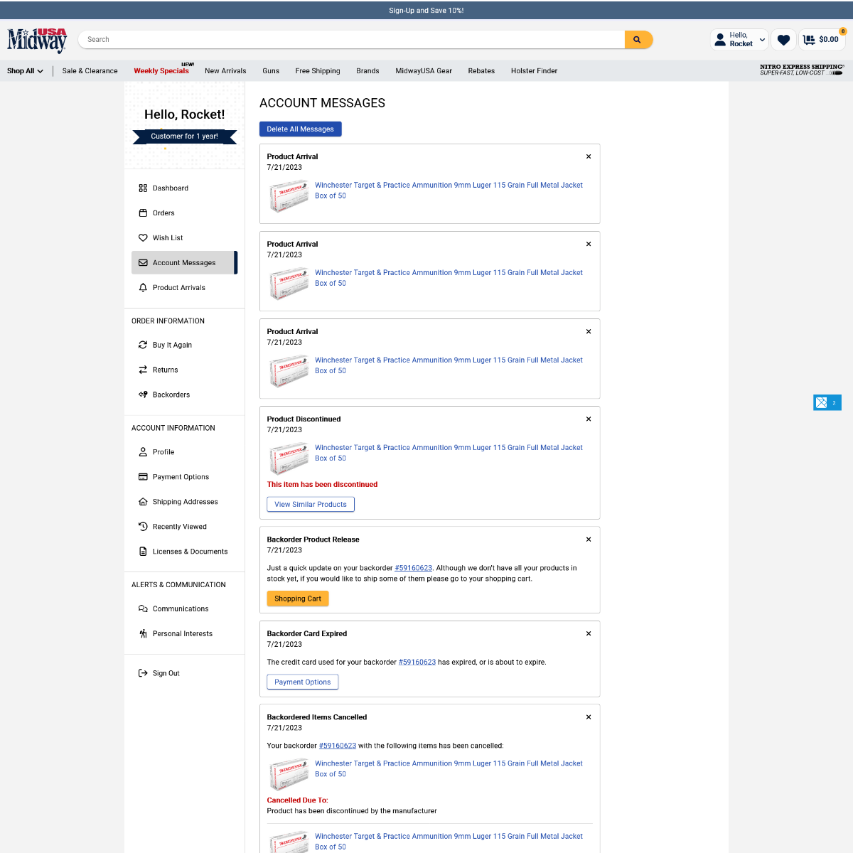
Account Messages
Rebuilding The Account Messages Page
The Account Messages page on an e-commerce website serves as vital point of sharing important information between the company and its users. The page facilitates on-site information sharing about order updates, promotions, customer support, product arrivals, and more information. By revamping this page, the goal is to enhance the user experience, streamline communication, and ultimately boost customer satisfaction and retention.
My Role
As the primary developer for this project, my role was essential for bringing the new Account Messages page design to life. I collaborated closely with the primary designer to understand the projects goal and translate them into technical requirements. My responsibilities encompassed front-end development, ensuring responsiveness across different devices and browsers, while also focusing on optimizing page performance. During this process, I crafted a new DOM using Elm, built the styling with SCSS, and ensured back-end functionality to support bringing the correct data to the front end.
User Research
The process of rebuilding the Account Messages page involved several key steps. First, beyond an outdated ui, we performed an analysis of the current state of the page through user feedback, pain points, and identified common usage patterns. This analysis was achieved through user testing and analytical data.
Once data analysis was complete, the primary designer did initial benchmarking of competitor websites and other industry leaders. This created fuller picture of what user expect from other sites they are browsing, and gave us a starting point for new features we wanted to implement.
An initial MVP was created, which featured an updated styling that was more concise and easy to read, was mobile friendly, and had the ability to be expanded upon for future messages and features.
Implementing The Design
The new design was brought to life, using our primary front-end language, Elm. Custom styling was created with SCSS and utility classes. After an analysis of the design I began building out an initial DOM structure. After an initial structure was created, I would begin adding the data calls to be able to work with real data.
Once real data was on the page, I would work on implementing visual elements. This involved creating custom SCSS styling to handle different message styling and covering anything that could not be implemented with utility classes.
Finally, testing would be done to ensure all edge cases were implemented. This testing would identify any missed edge cases, issues/bugs with functionality, and ensured page responsiveness and compatibility in different browsers. This would ensure a smooth user experience upon initial release.
Focusing on the page’s detail, responsiveness, and functionality the page MVP was created. Through the implementation of the new page design, I was receptive to any user testing feedback, and would make any necessary adjustments to address any usability concerns or issues that arose during these tests.
Further Enhancements
After the new page design was released and implemented, there were several places that we still wanted to enhance to further the user experience.

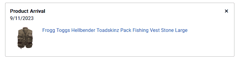
We added a place-holder and load-in animation when initially loading in the user’s messages. This indicates to the user that there are messages to be loaded, but the service is still getting the user’s messages.

We also added a animation when changing the display when deleting all messages. This helps keep the user connected as the tool opens to confirm the user action.
When deleting a single message a small indicator appears to indicate that the deletion was being performed, afterwards we decided to keep placeholder showing that the deletion was successful. Unfortunately, we ran out of time to finish polishing this layout animation, but this is definitely an area of interest to improve when time allows in the future.